در این بخش، به آموزش position در بوت استرپ میپردازیم و نحوه تنظیم موقعیت یک عنصر در صفحه با استفاده از کلاسهای کمکی فریم ورک بوت استرپ را بررسی میکنیم. بوت استرپ مجموعهای از کلاسهای کمکی (Helper Classes) را ارائه میدهد که به توسعه دهندگان اجازه میدهند موقعیت عناصر مختلف را به سادگی روی صفحه مشخص کنند. برخی از این کلاسها عبارتند از:
-
.fixed-top -
.fixed-bottom -
.sticky-top -
.sticky-bottom
در ادامه، به بررسی هر یک از این کلاسها همراه با مثال میپردازیم.
کلاس fixed-top در بوت استرپ
کلاس .fixed-top باعث میشود عنصر مورد نظر همیشه در بالای صفحه نمایش (viewport) قرار بگیرد، بهطوریکه از لبه چپ تا لبه راست صفحه امتداد داشته باشد.
این کلاس زمانی کاربرد دارد که بخواهید نوار ناوبری یا هدر سایت حتی هنگام اسکرول کردن کاربر به سمت پایین، همچنان در بالای صفحه قابل مشاهده باقی بماند.
|
1 2 3 4 5 6 7 8 9 10 11 12 13 14 15 16 17 18 19 20 21 22 23 |
<!DOCTYPE html> <html> <head> <title>Position - Fixed top</title> <meta charset="UTF-8"> <meta http-equiv="X-UA-Compatible" content="IE=edge"> <meta name="viewport" content="width=device-width, initial-scale=1.0"> <link href="https://cdn.jsdelivr.net/npm/bootstrap@5.3.0-alpha3/dist/css/bootstrap.min.css" rel="stylesheet"> <script src="https://cdn.jsdelivr.net/npm/bootstrap@5.3.0-alpha3/dist/js/bootstrap.bundle.min.js"></script> </head> <body style="height:1500px"> <nav class="navbar navbar-expand-lg text-bg-success navbar-dark fixed-top"> <div class="container-fluid"> <a class="navbar-brand" href="#">Use of .fixed-top class</a> </div> </nav> <div class="container-fluid" style="margin-top:80px"> <h4>Position fixed at top</h4> <p>The class .fixed-top of Bootstrap sets the position of the element at top of the screen.</p> <h1>Scroll down the page to see the position</h1> </div> </body> </html> |
کلاس fixed-bottom در بوت استرپ
کلاس .fixed-bottom موقعیت یک عنصر را در پایین صفحه نمایش (viewport) تنظیم میکند، بهطوری که از لبه چپ تا لبه راست صفحه امتداد پیدا میکند.
این کلاس برای زمانی مناسب است که بخواهید عناصری مانند نوار ابزار، دکمههای مهم یا پیامهای هشدار در پایین صفحه همواره در معرض دید کاربر باقی بمانند، حتی هنگام اسکرول کردن به سمت بالا یا پایین.
|
1 2 3 4 5 6 7 8 9 10 11 12 13 14 15 16 17 18 19 20 21 22 23 |
<!DOCTYPE html> <html> <head> <title>Position - Fixed bottom</title> <meta charset="UTF-8"> <meta http-equiv="X-UA-Compatible" content="IE=edge"> <meta name="viewport" content="width=device-width, initial-scale=1.0"> <link href="https://cdn.jsdelivr.net/npm/bootstrap@5.3.0-alpha3/dist/css/bootstrap.min.css" rel="stylesheet"> <script src="https://cdn.jsdelivr.net/npm/bootstrap@5.3.0-alpha3/dist/js/bootstrap.bundle.min.js"></script> </head> <body style="height:1500px"> <nav class="navbar navbar-expand-lg text-bg-primary navbar-dark fixed-bottom"> <div class="container-fluid"> <a class="navbar-brand" href="#">Use of .fixed-bottom class</a> </div> </nav> <div class="container-fluid" style="margin-top:80px"> <h4>Position fixed at bottom</h4> <p>The class .fixed-bottom of Bootstrap sets the position of the element at the bottom of the page.</p> <h1>Scroll down the page to see the position</h1> </div> </body> </html> |
کلاس sticky-top در بوت استرپ
کلاس .sticky-top برای ایجاد عنصری استفاده میشود که هنگام اسکرول، به بالای صفحه “میچسبد”. این عنصر ابتدا همراه با سایر محتوا حرکت میکند، اما بهمحض اینکه کاربر از موقعیت اولیه آن عبور کند، در بالای صفحه ثابت میماند.
برخلاف کلاس .fixed-top که از همان ابتدای بارگذاری در بالا قرار دارد، .sticky-top تنها بعد از اسکرول فعال میشود. بنابراین، اگر میخواهید بخشی مانند منو یا راهنمای سریع همیشه در دسترس کاربر باشد اما جای زیادی اشغال نکند، این گزینه انتخاب مناسبی است.
|
1 2 3 4 5 6 7 8 9 10 11 12 13 14 15 16 17 18 19 20 21 22 23 24 25 26 27 28 29 30 31 32 |
<!DOCTYPE html> <html lang="en"> <head> <title>Position - Sticky top</title> <meta charset="UTF-8"> <meta http-equiv="X-UA-Compatible" content="IE=edge"> <meta name="viewport" content="width=device-width, initial-scale=1.0"> <link href="https://cdn.jsdelivr.net/npm/bootstrap@5.3.0-alpha3/dist/css/bootstrap.min.css" rel="stylesheet"> <script src="https://cdn.jsdelivr.net/npm/bootstrap@5.3.0-alpha3/dist/js/bootstrap.bundle.min.js"></script> </head> <body style="height:1500px"> <div class="container-fluid mt-3"> <h3>Sticky Navbar</h3> <p>The class <b>.sticky-top</b> is used to create a sticky element that remains at the top of the screen, from edge to edge, but only after you scroll past it.</p> <p>Scroll down the page to see the effect.</p> </div> <nav class="navbar navbar-expand-lg bg-dark navbar-dark sticky-top"> <div class="container-fluid"> <a class="navbar-brand" href="#">Sticky top</a> </div> </nav> <div class="container-fluid"> <p>Example for .sticky-top class of Bootstrap to set the position of an element, like a navbar, stick to the top of the screen.</p> <p>Example for .sticky-top class of Bootstrap to set the position of an element, like a navbar, stick to the top of the screen.</p> <p>Example for .sticky-top class of Bootstrap to set the position of an element, like a navbar, stick to the top of the screen.</p> <p>Example for .sticky-top class of Bootstrap to set the position of an element, like a navbar, stick to the top of the screen.</p> <p>Example for .sticky-top class of Bootstrap to set the position of an element, like a navbar, stick to the top of the screen.</p> <p>Example for .sticky-top class of Bootstrap to set the position of an element, like a navbar, stick to the top of the screen.</p> <p>Example for .sticky-top class of Bootstrap to set the position of an element, like a navbar, stick to the top of the screen.</p> </div> </body> </html> |
کلاس sticky-top واکنش گرا (Responsive)
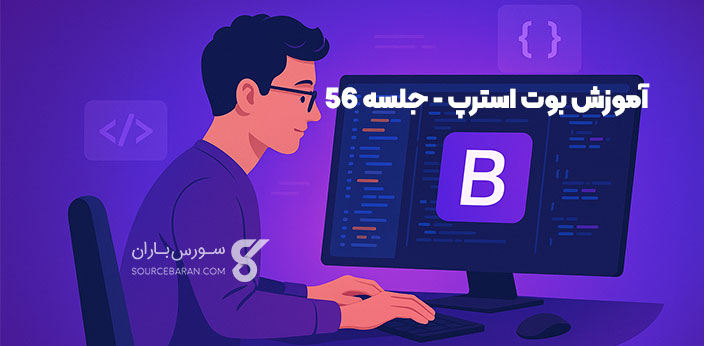
در طراحی واکنش گرا، کلاسهای sticky-top به شما کمک میکنند تا منوی ناوبری یا هدر سایت همیشه در بالای صفحه باقی بماند. هنگامی که کاربر صفحه را به سمت پایین اسکرول میکند، این کلاسها باعث میشوند آن عنصر به بالای صفحه “بچسبد”. به این ترتیب، منو همیشه در معرض دید قرار میگیرد و دسترسی به آن سریعتر انجام میشود. اگر به دنبال یادگیری عملی و قدمبهقدم این مفاهیم هستید، پیشنهاد میکنیم با آموزش پروژه محور بوت استرپ شروع کنید.
بوت استرپ چند کلاس sticky-top ارائه میدهد که بسته به اندازه صفحه نمایش فعال میشوند:
-
.sticky-sm-top: عنصر را در نمایشگرهای کوچک به بالای صفحه میچسباند -
.sticky-md-top: در نمایشگرهای متوسط فعال میشود -
.sticky-lg-top: در نمایشگرهای بزرگ کاربرد دارد -
.sticky-xl-top: در صفحه نمایشهای خیلی بزرگ استفاده میشود -
.sticky-xxl-top: مخصوص صفحه نمایشهای بسیار بزرگ است
با این کلاسها میتوانید بهصورت دقیق مشخص کنید که عنصر در چه اندازهای از صفحه، حالت چسبنده داشته باشد. در نتیجه، طراحی شما در همه دستگاهها حرفهایتر و کاربرپسندتر خواهد بود.
|
1 2 3 4 5 6 7 8 9 10 11 12 13 14 15 16 17 18 19 20 21 22 23 24 25 26 27 28 29 30 31 32 |
<!DOCTYPE html> <html lang="en"> <head> <title>Position - Responsive Sticky top</title> <meta charset="UTF-8"> <meta http-equiv="X-UA-Compatible" content="IE=edge"> <meta name="viewport" content="width=device-width, initial-scale=1.0"> <link href="https://cdn.jsdelivr.net/npm/bootstrap@5.3.0-alpha3/dist/css/bootstrap.min.css" rel="stylesheet"> <script src="https://cdn.jsdelivr.net/npm/bootstrap@5.3.0-alpha3/dist/js/bootstrap.bundle.min.js"></script> </head> <body style="height:1500px"> <div class="container-fluid mt-3"> <h3>Sticky Navbar</h3> <p>The class <b>.sticky-lg-top</b> is a responsive class, used to create a sticky element that remains at the top of the screen, from edge to edge, but only after you scroll past it.</p> <p>Scroll down the page to see the effect.</p> </div> <nav class="navbar navbar-expand-lg bg-dark navbar-dark sticky-lg-top"> <div class="container-fluid"> <a class="navbar-brand" href="#">Responsive Sticky top</a> </div> </nav> <div class="container-fluid"> <p>Example for .sticky-lg-top class of Bootstrap to set the position of an element, like a navbar, stick to the top of the screen.</p> <p>Example for .sticky-lg-top class of Bootstrap to set the position of an element, like a navbar, stick to the top of the screen.</p> <p>Example for .sticky-lg-top class of Bootstrap to set the position of an element, like a navbar, stick to the top of the screen.</p> <p>Example for .sticky-lg-top class of Bootstrap to set the position of an element, like a navbar, stick to the top of the screen.</p> <p>Example for .sticky-lg-top class of Bootstrap to set the position of an element, like a navbar, stick to the top of the screen.</p> <p>Example for .sticky-lg-top class of Bootstrap to set the position of an element, like a navbar, stick to the top of the screen.</p> <p>Example for .sticky-lg-top class of Bootstrap to set the position of an element, like a navbar, stick to the top of the screen.</p> </div> </body> </html> |
کلاس sticky-bottom در بوت استرپ
کلاس .sticky-bottom برای ساختن عنصری کاربرد دارد که پس از اسکرول کردن کاربر و عبور از موقعیت اولیه آن، به پایین صفحه میچسبد و از لبه چپ تا لبه راست امتداد پیدا میکند.
در ابتدا، این عنصر مانند سایر محتوا همراه با اسکرول حرکت میکند. اما بهمحض اینکه کاربر از جایگاه اصلی آن عبور کند، در پایین صفحه ثابت میشود. این ویژگی برای نمایش دکمههای عملیاتی، پیامهای مهم یا نوارهای اعلان بسیار مفید است؛ بهویژه زمانی که نمیخواهید این موارد فضای زیادی اشغال کنند اما همچنان در دسترس کاربر باقی بمانند.
|
1 2 3 4 5 6 7 8 9 10 11 12 13 14 15 16 17 18 19 20 21 22 23 24 25 26 27 28 29 30 31 32 33 |
<!DOCTYPE html> <html> <head> <title>Position - sticky bottom</title> <meta charset="UTF-8"> <meta http-equiv="X-UA-Compatible" content="IE=edge"> <meta name="viewport" content="width=device-width, initial-scale=1.0"> <link href="https://cdn.jsdelivr.net/npm/bootstrap@5.3.0-alpha3/dist/css/bootstrap.min.css" rel="stylesheet"> <script src="https://cdn.jsdelivr.net/npm/bootstrap@5.3.0-alpha3/dist/js/bootstrap.bundle.min.js"></script> </head> <body style=height:1000px class="d-flex flex-column"> <!-- Navbar --> <nav class="navbar navbar-expand-lg navbar-light bg-light"> <div class="container"> <a class="navbar-brand" href="#">Sticky Bottom Example</a> </div> </nav> <!-- Content --> <div class="container-fluid flex-grow-1"> <h4>sticky bottom</h4> <p>Here is an example for responsive sticky bottom. Its a helper class in bootstrap 5.</p> <p>Here is an example for responsive sticky bottom. Its a helper class in bootstrap 5.</p> <p>Here is an example for responsive sticky bottom. Its a helper class in bootstrap 5.</p> <p>Here is an example for responsive sticky bottom. Its a helper class in bootstrap 5.</p> </div> <!-- Sticky Footer --> <footer class="footer text-bg-info py-3 sticky-bottom"> <div class="container"> <span class="display-6 text-dark">Sticky bottom</span> </div> </footer> </body> </html> |
sticky-bottom واکنش گرا (Responsive)
بوت استرپ مجموعهای از کلاس های واکنش گرا برای sticky-bottom ارائه میدهد که به شما امکان میدهد عناصر را در پایین صفحه، بسته به اندازه نمایشگر، بهصورت چسبنده تنظیم کنید. این کلاس ها برای زمانی مناسب هستند که بخواهید دکمه ها، پیام ها یا نوارهای اعلان فقط در اندازه های خاصی از صفحه نمایش به پایین صفحه بچسبند.
در ادامه، کلاس های مربوط به sticky-bottom واکنش گرا را مشاهده میکنید:
-
.sticky-sm-bottom: چسباندن عنصر به پایین صفحه در نمایشگرهای کوچک -
.sticky-md-bottom: فعال شدن در نمایشگرهای متوسط -
.sticky-lg-bottom: مخصوص نمایشگرهای بزرگ -
.sticky-xl-bottom: قابل استفاده در صفحه های بسیار بزرگ -
.sticky-xxl-bottom: مناسب نمایشگرهای فوقالعاده بزرگ
این کلاس ها به شما انعطافپذیری بیشتری در طراحی صفحات واکنش گرا میدهند. بهاینترتیب، میتوانید تجربه کاربری را بر اساس اندازه دستگاه بهینه سازی کنید.
اکنون یک مثال ساده را با استفاده از یکی از این کلاسها بررسی میکنیم.
|
1 2 3 4 5 6 7 8 9 10 11 12 13 14 15 16 17 18 19 20 21 22 23 24 25 26 27 28 29 30 31 32 33 |
<!DOCTYPE html> <html> <head> <title>Position - Responsive sticky bottom</title> <meta charset="UTF-8"> <meta http-equiv="X-UA-Compatible" content="IE=edge"> <meta name="viewport" content="width=device-width, initial-scale=1.0"> <link href="https://cdn.jsdelivr.net/npm/bootstrap@5.3.0-alpha3/dist/css/bootstrap.min.css" rel="stylesheet"> <script src="https://cdn.jsdelivr.net/npm/bootstrap@5.3.0-alpha3/dist/js/bootstrap.bundle.min.js"></script> </head> <body style=height:1000px class="d-flex flex-column"> <!-- Navbar --> <nav class="navbar navbar-expand-lg navbar-light bg-light"> <div class="container"> <a class="navbar-brand" href="#">Responsive Sticky Bottom Example</a> </div> </nav> <!-- Content --> <div class="container-fluid flex-grow-1"> <h4>Responsive sticky bottom</h4> <p>Here is an example for responsive sticky bottom. Its a helper class in bootstrap 5.</p> <p>Here is an example for responsive sticky bottom. Its a helper class in bootstrap 5.</p> <p>Here is an example for responsive sticky bottom. Its a helper class in bootstrap 5.</p> <p>Here is an example for responsive sticky bottom. Its a helper class in bootstrap 5.</p> </div> <!-- Sticky Footer --> <footer class="footer text-bg-warning py-3 sticky-lg-bottom"> <div class="container"> <span class="display-6 text-dark">Sticky bottom</span> </div> </footer> </body> </html> |
راستی! برای دریافت مطالب جدید در کانال تلگرام یا پیج اینستاگرام سورس باران عضو شوید.
- انتشار: 2 جولای 2025
دسته بندی موضوعات
- آموزش ارز دیجیتال
- آموزش برنامه نویسی
- آموزش متنی برنامه نویسی
- اطلاعیه و سایر مطالب
- پروژه برنامه نویسی
- دوره های تخصصی برنامه نویسی
- رپورتاژ
- فیلم های آموزشی
- ++C
- ADO.NET
- Adobe Flash
- Ajax
- AngularJS
- apache
- ARM
- Asp.Net
- ASP.NET MVC
- AVR
- Bootstrap
- CCNA
- CCNP
- CMD
- CSS
- Dreameaver
- EntityFramework
- HTML
- IOS
- jquery
- Linq
- Mysql
- Oracle
- PHP
- PHPMyAdmin
- Rational Rose
- silver light
- SQL Server
- Stimulsoft Reports
- Telerik
- UML
- VB.NET&VB6
- WPF
- Xml
- آموزش های پروژه محور
- اتوکد
- الگوریتم تقریبی
- امنیت
- اندروید
- اندروید استودیو
- بک ترک
- بیسیک فور اندروید
- پایتون
- جاوا
- جاوا اسکریپت
- جوملا
- دلفی
- دوره آموزش Go
- دوره های رایگان پیشنهادی
- زامارین
- سئو
- ساخت CMS
- سی شارپ
- شبکه و مجازی سازی
- طراحی الگوریتم
- طراحی بازی
- طراحی وب
- فتوشاپ
- فریم ورک codeigniter
- فلاتر
- کانستراکت
- کریستال ریپورت
- لاراول
- معماری کامپیوتر
- مهندسی اینترنت
- هوش مصنوعی
- یونیتی
- کتاب های آموزشی
- Android
- ASP.NET
- AVR
- LINQ
- php
- Workflow
- اچ تی ام ال
- بانک اطلاعاتی
- برنامه نویسی سوکت
- برنامه نویسی موبایل
- پاسکال
- پایان نامه
- پایتون
- جاوا
- جاوا اسکریپت
- جی کوئری
- داده کاوی
- دلفی
- رباتیک
- سئو
- سایر کتاب ها
- سخت افزار
- سی اس اس
- سی پلاس پلاس
- سی شارپ
- طراحی الگوریتم
- فتوشاپ
- مقاله
- مهندسی نرم افزار
- هک و امنیت
- هوش مصنوعی
- ویژوال بیسیک
- نرم افزار و ابزار برنامه نویسی
- وردپرس