
در این بخش ابزار کنترل overflow در بوت استرپ را معرفی میکنیم. با استفاده از کلاس های overflow در بوت استرپ، میتوانید نحوه نمایش محتوایی را که از محدوده یک عنصر خارج میشود، بهراحتی مدیریت کنید.
بوت استرپ چند کلاس کاربردی برای کنترل overflow ارائه میدهد. این کلاسها بهصورت پیشفرض واکنش گرا نیستند؛ بنابراین برای اعمال آنها در اندازه های مختلف صفحه، باید تنظیمات جداگانهای انجام دهید. در آموزش پروژه محور بوت استرپ معمولاً از همین کلاس ها برای مدیریت محتوای اضافی در طراحی عناصر پویا استفاده میشود. بهویژه زمانی که عناصر مانند کارت ها، جداول یا فرم ها ممکن است محتوایی فراتر از فضای مشخصشده داشته باشند.
در جدول زیر، عملکرد هر کلاس را مشاهده میکنید:
| کلاس | عملکرد |
|---|---|
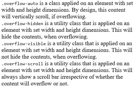
.overflow-auto |
اگر محتوا از اندازه عنصر بیشتر شود، مرورگر بهطور خودکار نوار پیمایش اضافه میکند. |
.overflow-hidden |
در صورت زیاد بودن محتوا، بخشهای اضافه را پنهان میکند و قابل مشاهده نخواهد بود. |
.overflow-scroll |
نوار پیمایش را همواره نمایش میدهد، چه محتوا از اندازه عنصر بیشتر باشد یا نباشد. |
.overflow-visible |
اجازه میدهد محتوا از محدوده عنصر فراتر برود، بدون اینکه بریده یا اسکرول شود. |
در ادامه با یک مثال، نحوه استفاده از این کلاسها را بهتر بررسی میکنیم:
|
1 2 3 4 5 6 7 8 9 10 11 12 13 14 15 16 17 18 19 20 21 22 23 24 25 26 27 28 29 30 31 32 33 34 35 36 37 38 39 40 41 42 |
<!DOCTYPE html> <html> <head> <title>Bootstrap - Overflow</title> <meta charset="UTF-8"> <meta http-equiv="X-UA-Compatible" content="IE=edge"> <meta name="viewport" content="width=device-width, initial-scale=1.0"> <link href="https://cdn.jsdelivr.net/npm/bootstrap@5.3.0-alpha3/dist/css/bootstrap.min.css" rel="stylesheet"> <script src="https://cdn.jsdelivr.net/npm/bootstrap@5.3.0-alpha3/dist/js/bootstrap.bundle.min.js"></script> </head> <body> <div class="container p-3"> <h4 class="text-start text-primary"> Overflow utility example</h4> <div class="overflow-auto mt-3 pb-5 bg-light" style="max-width: 360px; max-height: 80px;"> <code>.overflow-auto</code> is a class applied on an element with set width and height dimensions. By design, this content will vertically scroll, if overflowing. </div> <div class="overflow-hidden mt-5 pb-5 bg-light" style="max-width: 360px; max-height: 80px;"> <code>.overflow-hidden</code> is a utility class that is applied on an element with set width and height dimensions. This will hide the contents, when overflowing. </div> <div class="overflow-visible mt-5 pb-5 bg-light" style="max-width: 360px; max-height: 80px;"> <code>.overflow-visible</code> is a utility class that is applied on an element with set width and height dimensions. This will not hide the contents, when overflowing. </div> <div class="overflow-scroll mt-5 pb-5 bg-light" style="max-width: 360px; max-height: 80px;"> <code>.overflow-scroll</code> is a utility class that is applied on an element with set width and height dimensions. This will always show a scroll bar irrespective of whether the content will overflow or not. </div> <div class="overflow-scroll mt-5 pb-5 bg-light" style="max-width: 360px; max-height: 80px;"> <code>.overflow-scroll</code> is a utility class that shows a scroll bar always. </div> </div> </body> </html> |
ویژگی overflow-x در بوت استرپ
در این بخش با ویژگی overflow-x در بوت استرپ آشنا میشویم. این ویژگی برای کنترل رفتار محتوای اضافی در محور افقی استفاده میشود؛ یعنی زمانی که محتوای یک عنصر از عرض آن بیشتر شود، مشخص میکنیم چه اتفاقی بیفتد.
ویژگی overflow-x چهار مقدار مختلف دارد که هر کدام بهکمک یک کلاس مشخص در بوت استرپ قابل استفاده هستند:
| کلاس | عملکرد |
|---|---|
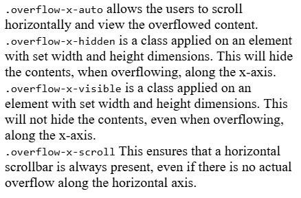
.overflow-x-auto |
اگر عرض محتوا از عرض عنصر بیشتر شود، بهصورت خودکار نوار پیمایش افقی اضافه میشود. |
.overflow-x-hidden |
محتوای اضافی که از عرض عنصر بیرون زده باشد، مخفی میشود و قابل مشاهده یا اسکرول نخواهد بود. |
.overflow-x-scroll |
نوار پیمایش افقی را همیشه نمایش میدهد، حتی اگر محتوا از عرض عنصر بیشتر نشده باشد. |
.overflow-x-visible |
به محتوا اجازه میدهد بدون اسکرول یا برش، از مرز افقی عنصر خارج شود. |
در ادامه، با مثالی ساده نحوه استفاده از این کلاسها را بررسی میکنیم:
|
1 2 3 4 5 6 7 8 9 10 11 12 13 14 15 16 17 18 19 20 21 22 23 24 25 26 27 28 29 30 31 32 33 34 35 36 37 |
<!DOCTYPE html> <html> <head> <title>Bootstrap - Overflow</title> <meta charset="UTF-8"> <meta http-equiv="X-UA-Compatible" content="IE=edge"> <meta name="viewport" content="width=device-width, initial-scale=1.0"> <link href="https://cdn.jsdelivr.net/npm/bootstrap@5.3.0-alpha3/dist/css/bootstrap.min.css" rel="stylesheet"> <script src="https://cdn.jsdelivr.net/npm/bootstrap@5.3.0-alpha3/dist/js/bootstrap.bundle.min.js"></script> </head> <body> <div class="container p-3"> <h4>Overflow-x-* Example</h4> <div class="overflow-x-auto mt-3 pb-5" style="max-width: 340px; max-height: 90px;"> <code>.overflow-x-auto</code> allows the users to scroll horizontally and view the overflowed content. </div> <div class="overflow-x-hidden mt-5 pb-5" style="max-width: 340px; max-height: 85px;"> <code>.overflow-x-hidden</code> is a class applied on an element with set width and height dimensions. This will hide the contents, when overflowing, along the x-axis. </div> <div class="overflow-x-visible mt-5 pb-5" style="max-width: 340px; max-height: 80px;"> <code>.overflow-x-visible</code> is a class applied on an element with set width and height dimensions. This will not hide the contents, even when overflowing, along the x-axis. </div> <div class="overflow-x-scroll mt-5 pb-5" style="max-width: 340px; max-height: 120px;"> <code>.overflow-x-scroll</code> This ensures that a horizontal scrollbar is always present, even if there is no actual overflow along the horizontal axis. </div> </div> </body> </html> |
ویژگی overflow-y در بوت استرپ
ویژگی overflow-y در بوت استرپ برای کنترل رفتار محتوای اضافی در محور عمودی (یعنی ارتفاع عنصر) استفاده میشود. این ویژگی تعیین میکند که اگر ارتفاع محتوا از ارتفاع عنصر بیشتر شود، چه اتفاقی بیفتد.
بوت استرپ برای این منظور کلاسهایی ارائه داده که هرکدام رفتار مشخصی را در محور عمودی اعمال میکنند:
| کلاس | عملکرد |
|---|---|
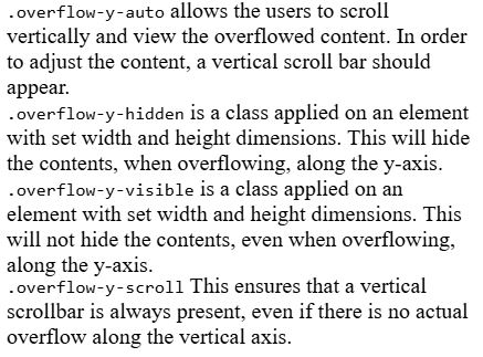
.overflow-y-auto |
اگر ارتفاع محتوا از ارتفاع عنصر بیشتر باشد، بهصورت خودکار نوار پیمایش عمودی ظاهر میشود. |
.overflow-y-hidden |
محتوای اضافی که از ارتفاع عنصر بیرون میزند، مخفی میشود و قابل مشاهده یا اسکرول نخواهد بود. |
.overflow-y-scroll |
نوار پیمایش عمودی را همیشه نشان میدهد، چه محتوا از ارتفاع عنصر بیشتر باشد یا نباشد. |
.overflow-y-visible |
اجازه میدهد محتوا بدون برش یا اسکرول از محدوده عمودی عنصر بیرون بزند. |
در ادامه، مثالی را بررسی میکنیم تا نحوه استفاده از این کلاسها بهتر مشخص شود:
|
1 2 3 4 5 6 7 8 9 10 11 12 13 14 15 16 17 18 19 20 21 22 23 24 25 26 27 28 29 30 31 32 33 34 35 36 37 38 |
<!DOCTYPE html> <html> <head> <title>Bootstrap - Overflow</title> <meta charset="UTF-8"> <meta http-equiv="X-UA-Compatible" content="IE=edge"> <meta name="viewport" content="width=device-width, initial-scale=1.0"> <link href="https://cdn.jsdelivr.net/npm/bootstrap@5.3.0-alpha3/dist/css/bootstrap.min.css" rel="stylesheet"> <script src="https://cdn.jsdelivr.net/npm/bootstrap@5.3.0-alpha3/dist/js/bootstrap.bundle.min.js"></script> </head> <body> <div class="container mt-3"> <h4>Overflow-y-* Example</h4> <div class="overflow-y-auto mt-3 pb-5" style="max-width: 340px; max-height: 80px;"> <code>.overflow-y-auto</code> allows the users to scroll vertically and view the overflowed content. In order to adjust the content, a vertical scroll bar should appear. </div> <div class="overflow-y-hidden mt-5 pb-5" style="max-width: 340px; max-height: 80px;"> <code>.overflow-y-hidden</code> is a class applied on an element with set width and height dimensions. This will hide the contents, when overflowing, along the y-axis. </div> <div class="overflow-y-visible mt-5 pb-5" style="max-width: 340px; max-height: 70px;"> <code>.overflow-y-visible</code> is a class applied on an element with set width and height dimensions. This will not hide the contents, even when overflowing, along the y-axis. </div> <div class="overflow-y-scroll mt-5" style="max-width: 340px; max-height: 80px;"> <code>.overflow-y-scroll</code> This ensures that a vertical scrollbar is always present, even if there is no actual overflow along the vertical axis. </div> </div> </body> </html> |
راستی! برای دریافت مطالب جدید در کانال تلگرام یا پیج اینستاگرام سورس باران عضو شوید.
- انتشار: 15 جولای 2025
دسته بندی موضوعات
- آموزش ارز دیجیتال
- آموزش برنامه نویسی
- آموزش متنی برنامه نویسی
- اطلاعیه و سایر مطالب
- پروژه برنامه نویسی
- دوره های تخصصی برنامه نویسی
- رپورتاژ
- فیلم های آموزشی
- ++C
- ADO.NET
- Adobe Flash
- Ajax
- AngularJS
- apache
- ARM
- Asp.Net
- ASP.NET MVC
- AVR
- Bootstrap
- CCNA
- CCNP
- CMD
- CSS
- Dreameaver
- EntityFramework
- HTML
- IOS
- jquery
- Linq
- Mysql
- Oracle
- PHP
- PHPMyAdmin
- Rational Rose
- silver light
- SQL Server
- Stimulsoft Reports
- Telerik
- UML
- VB.NET&VB6
- WPF
- Xml
- آموزش های پروژه محور
- اتوکد
- الگوریتم تقریبی
- امنیت
- اندروید
- اندروید استودیو
- بک ترک
- بیسیک فور اندروید
- پایتون
- جاوا
- جاوا اسکریپت
- جوملا
- دلفی
- دوره آموزش Go
- دوره های رایگان پیشنهادی
- زامارین
- سئو
- ساخت CMS
- سی شارپ
- شبکه و مجازی سازی
- طراحی الگوریتم
- طراحی بازی
- طراحی وب
- فتوشاپ
- فریم ورک codeigniter
- فلاتر
- کانستراکت
- کریستال ریپورت
- لاراول
- معماری کامپیوتر
- مهندسی اینترنت
- هوش مصنوعی
- یونیتی
- کتاب های آموزشی
- Android
- ASP.NET
- AVR
- LINQ
- php
- Workflow
- اچ تی ام ال
- بانک اطلاعاتی
- برنامه نویسی سوکت
- برنامه نویسی موبایل
- پاسکال
- پایان نامه
- پایتون
- جاوا
- جاوا اسکریپت
- جی کوئری
- داده کاوی
- دلفی
- رباتیک
- سئو
- سایر کتاب ها
- سخت افزار
- سی اس اس
- سی پلاس پلاس
- سی شارپ
- طراحی الگوریتم
- فتوشاپ
- مقاله
- مهندسی نرم افزار
- هک و امنیت
- هوش مصنوعی
- ویژوال بیسیک
- نرم افزار و ابزار برنامه نویسی
- وردپرس