
در این بخش با ساختار ستون بندی در بوت استرپ آشنا میشوید. سیستم گرید بوت استرپ که بر پایه Flexbox طراحی شده، به شما این امکان را میدهد که ستون ها را با گزینههایی مانند تراز کردن، ترتیببندی (ordering) و ایجاد فاصله (offsetting) بهدلخواه تنظیم کنید.
همچنین با استفاده از کلاسهای مخصوص ستون، میتوانید حتی عناصر خارج از ساختار گرید را هم بهطور دقیق کنترل کنید.
پیش از یادگیری نحوه تغییر و سفارشیسازی ستونها، پیشنهاد میشود ابتدا بخش آموزش گرید در بوت استرپ را مطالعه کنید.
نحوه عملکرد ستون ها در بوت استرپ
- ستون ها در بوت استرپ بر پایه معماری فلکس باکس ساخته شدهاند. فلکس باکس این امکان را فراهم میکند که بتوانید هم بهصورت تکی و هم گروهی، ستون ها را در سطح ردیف کنترل و تنظیم کنید.
- در ساختار گرید بوت استرپ، همه محتواها باید درون ستون ها قرار گیرند. سلسله مراتب این سیستم از کانتینر شروع میشود، سپس به ردیف (row)، بعد به ستون (column) و در نهایت به محتوای داخلی میرسد. ترکیب مستقیم محتوا با ستون ها بدون رعایت ساختار ممکن است باعث ایجاد رفتارهای پیشبینینشده در چیدمان شود.
- در آموزش طراحی سایت با بوت استرپ، یکی از بخشهای مهم، ستون بندی و نحوه استفاده از کلاس های واکنش گرا برای ساخت چیدمان های حرفهای است. در هر سطح از نقاط شکست (breakpoint) شش دسته مختلف وجود دارد و میتوانید تا دوازده ستون در هر ردیف ایجاد کنید. این ابزارها کمک میکنند چیدمانی کاملاً سفارشیسازیشده طراحی کنید.
تراز کردن (Alignment)
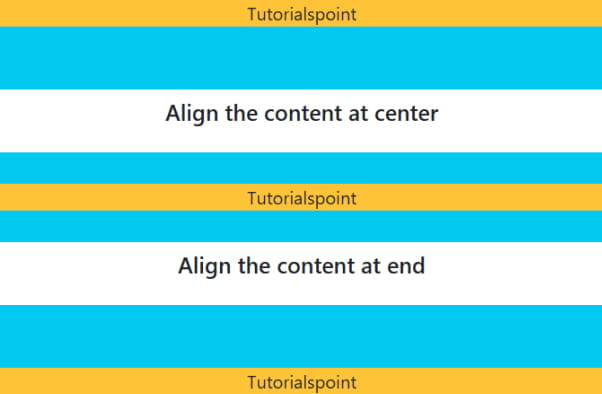
برای تراز کردن افقی و عمودی ستون ها از ابزارهای تراز بندی فلکس باکس استفاده کنید.
تراز عمودی در بوت استرپ
برای تغییر محل قرارگیری عناصر بهصورت عمودی، از کلاسهای تراز عمودی استفاده کنید:
-
استفاده از کلاس
.align-items-startبرای تراز محتوا از بالای ستون -
استفاده از کلاس
.align-items-centerبرای قرارگیری محتوا در مرکز ستون -
استفاده از کلاس
.align-items-endبرای تراز محتوا در پایین ستون
|
1 2 3 4 5 6 7 8 9 10 11 12 13 14 15 16 17 18 19 20 21 22 23 24 25 26 27 28 29 30 31 32 33 |
<!DOCTYPE html> <html lang="en"> <head> <title>Bootstrap - Columns</title> <meta charset="UTF-8"> <meta http-equiv="X-UA-Compatible" content="IE=edge"> <meta name="viewport" content="width=device-width, initial-scale=1.0"> <link href="https://cdn.jsdelivr.net/npm/bootstrap@5.3.0-alpha3/dist/css/bootstrap.min.css" rel="stylesheet"> <script src="https://cdn.jsdelivr.net/npm/bootstrap@5.3.0-alpha3/dist/js/bootstrap.bundle.min.js"></script> </head> <body> <div class="container text-center"> <h5>Align the content at start</h5> <div class="row align-items-start bg-info mt-4" style="min-height: 80px;"> <div class="col bg-warning"> Tutorialspoint </div> </div> <h5 class="mt-2">Align the content at center</h5> <div class="row align-items-center bg-info mt-4" style="min-height: 80px;"> <div class="col bg-warning"> Tutorialspoint </div> </div> <h5 class="mt-2">Align the content at end</h5> <div class="row align-items-end bg-info mt-4" style="min-height: 80px;"> <div class="col bg-warning"> Tutorialspoint </div> </div> </div> </body> </html> |
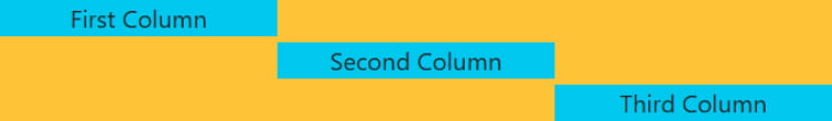
تراز هر ستون را به صورت جداگانه با استفاده از کلاسهای .align-self-* تنظیم کنید.
این کلاسها به شما امکان میدهند هر ستون را مستقل از سایر ستونها، در موقعیت دلخواه عمودی قرار دهید.
|
1 2 3 4 5 6 7 8 9 10 11 12 13 14 15 16 17 18 19 20 21 22 23 24 25 26 |
<!DOCTYPE html> <html lang="en"> <head> <title>Bootstrap - Columns</title> <meta charset="UTF-8"> <meta http-equiv="X-UA-Compatible" content="IE=edge"> <meta name="viewport" content="width=device-width, initial-scale=1.0"> <link href="https://cdn.jsdelivr.net/npm/bootstrap@5.3.0-alpha3/dist/css/bootstrap.min.css" rel="stylesheet"> <script src="https://cdn.jsdelivr.net/npm/bootstrap@5.3.0-alpha3/dist/js/bootstrap.bundle.min.js"></script> </head> <body> <div class="container text-center mt-4"> <div class="row bg-warning" style="min-height: 80px;"> <div class="col align-self-start bg-info"> First Column </div> <div class="col align-self-center bg-info"> Second Column </div> <div class="col align-self-end bg-info"> Third Column </div> </div> </div> </body> </html> |
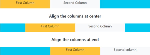
تراز افقی ستون ها در بوت استرپ
برای تنظیم تراز افقی ستون ها میتوانید از کلاسهای justify-content-* استفاده کنید. این کلاسها ستون ها را بهصورت افقی در محل موردنظر قرار میدهند.
-
استفاده از
justify-content-startبرای تراز ستون ها از ابتدای ردیف -
استفاده از
justify-content-centerبرای قرار دادن ستون ها در مرکز -
استفاده از
justify-content-endبرای تراز کردن ستون ها در انتهای ردیف
|
1 2 3 4 5 6 7 8 9 10 11 12 13 14 15 16 17 18 19 20 21 22 23 24 25 26 27 28 29 30 31 32 33 34 35 36 37 38 39 40 41 42 |
<!DOCTYPE html> <html lang="en"> <head> <title>Bootstrap - Columns</title> <meta charset="UTF-8"> <meta http-equiv="X-UA-Compatible" content="IE=edge"> <meta name="viewport" content="width=device-width, initial-scale=1.0"> <link href="https://cdn.jsdelivr.net/npm/bootstrap@5.3.0-alpha3/dist/css/bootstrap.min.css" rel="stylesheet"> <script src="https://cdn.jsdelivr.net/npm/bootstrap@5.3.0-alpha3/dist/js/bootstrap.bundle.min.js"> </script> </head> <body> <div class="container text-center mt-4"> <h5>Align the columns at start</h5> <div class="row justify-content-start bg-info mt-4" style="min-height: 40px;"> <div class="col-4 bg-warning"> First Column </div> <div class="col-4 bg-light"> Second Column </div> </div> <h5 class="mt-4">Align the columns at center</h5> <div class="row justify-content-center bg-info mt-4" style="min-height: 40px;"> <div class="col-4 bg-warning"> First Column </div> <div class="col-4 bg-light"> Second Column </div> </div> <h5 class="mt-4">Align the columns at end</h5> <div class="row justify-content-end bg-info mt-4" style="min-height: 40px;"> <div class="col-4 bg-warning"> First Column </div> <div class="col-4 bg-light"> Second column </div> </div> </div> </body> </html> |
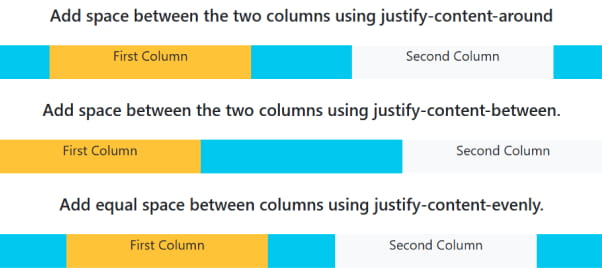
- از کلاس
justify-content-aroundاستفاده کنید تا فاصلهگذاری مساوی در اطراف دو ستون ایجاد شود. - از کلاس
justify-content-betweenبرای ایجاد فاصله فقط بین دو ستون استفاده کنید. - برای ایجاد فاصله کاملاً مساوی بین ستونهای سمت راست و چپ، از کلاس
justify-content-evenlyاستفاده کنید.
|
1 2 3 4 5 6 7 8 9 10 11 12 13 14 15 16 17 18 19 20 21 22 23 24 25 26 27 28 29 30 31 32 33 34 35 36 37 38 39 40 41 42 |
<!DOCTYPE html> <html lang="en"> <head> <title>Bootstrap - Columns</title> <meta charset="UTF-8"> <meta http-equiv="X-UA-Compatible" content="IE=edge"> <meta name="viewport" content="width=device-width, initial-scale=1.0"> <link href="https://cdn.jsdelivr.net/npm/bootstrap@5.3.0-alpha3/dist/css/bootstrap.min.css" rel="stylesheet"> <script src="https://cdn.jsdelivr.net/npm/bootstrap@5.3.0-alpha3/dist/js/bootstrap.bundle.min.js"></script> </head> <body> <div class="container text-center mt-4"> <h5 class="mt-4">Add space between the two columns using justify-content-around</h5> <div class="row justify-content-around bg-info mt-4" style="min-height: 40px;"> <div class="col-4 bg-warning"> First Column </div> <div class="col-4 bg-light"> Second Column </div> </div> <h5 class="mt-4">Add space between the two columns using justify-content-between.</h5> <div class="row justify-content-between bg-info mt-4" style="min-height: 40px;"> <div class="col-4 bg-warning"> First Column </div> <div class="col-4 bg-light"> Second Column </div> </div> <h5 class="mt-4">Add equal space between columns using justify-content-evenly.</h5> <div class="row justify-content-evenly bg-info mt-4" style="min-height: 40px;"> <div class="col-4 bg-warning"> First Column </div> <div class="col-4 bg-light"> Second Column </div> </div> </div> </body> </html> |
با کپی کردن کد بالا در ویرایشگر آنلاین، میتوانید آن را اجرا کنید.
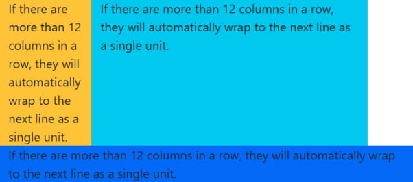
بسته بندی ستون ها (Column Wrapping) در بوت استرپ
اگر در یک ردیف بیش از ۱۲ ستون قرار گیرد، بوت استرپ بهصورت خودکار ستونهای اضافی را به خط بعد منتقل میکند و آنها را بهعنوان یک واحد کامل در ردیف جدید نمایش میدهد.
|
1 2 3 4 5 6 7 8 9 10 11 12 13 14 15 16 17 18 19 20 |
<!DOCTYPE html> <html lang="en"> <head> <title>Bootstrap - Columns</title> <meta charset="UTF-8"> <meta http-equiv="X-UA-Compatible" content="IE=edge"> <meta name="viewport" content="width=device-width, initial-scale=1.0"> <link href="https://cdn.jsdelivr.net/npm/bootstrap@5.3.0-alpha3/dist/css/bootstrap.min.css" rel="stylesheet"> <script src="https://cdn.jsdelivr.net/npm/bootstrap@5.3.0-alpha3/dist/js/bootstrap.bundle.min.js"></script> </head> <body> <div class="container"> <div class="row mt-2"> <div class="col-2 bg-warning">If there are more than 12 columns in a row, they will automatically wrap to the next line as a single unit.</div> <div class="col-6 bg-info">If there are more than 12 columns in a row, they will automatically wrap to the next line as a single unit.</div> <div class="col-9 bg-primary">If there are more than 12 columns in a row, they will automatically wrap to the next line as a single unit.</div> </div> </div> </body> </html> |
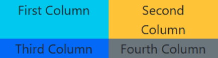
شکستن ستونها (Column Breaks)
برای شکستن ستون و انتقال آن به خط جدید در فلکس باکس، یک عنصر div با عرض ۱۰۰٪ بعد از ستونی که میخواهید ردیف از آن نقطه شکسته شود اضافه کنید.
این روش معمولاً در ساختارهایی با چندین .row استفاده میشود، اما توجه داشته باشید که همه روشهای پیادهسازی برای این کار مناسب نیستند.
|
1 2 3 4 5 6 7 8 9 10 11 12 13 14 15 16 17 18 19 20 21 22 23 24 |
<!DOCTYPE html> <html lang="en"> <head> <title>Bootstrap - Columns</title> <meta charset="UTF-8"> <meta http-equiv="X-UA-Compatible" content="IE=edge"> <meta name="viewport" content="width=device-width, initial-scale=1.0"> <link href="https://cdn.jsdelivr.net/npm/bootstrap@5.3.0-alpha3/dist/css/bootstrap.min.css" rel="stylesheet"> <script src="https://cdn.jsdelivr.net/npm/bootstrap@5.3.0-alpha3/dist/js/bootstrap.bundle.min.js"></script> </head> <body> <div class="container text-center"> <div class="row mt-2"> <div class="col-6 col-sm-3 bg-info">First Column</div> <div class="col-6 col-sm-3 bg-warning">Second Column</div> <div class="w-100"></div> <div class="col-6 col-sm-3 bg-primary">Third Column</div> <div class="col-6 col-sm-3 bg-secondary">Fourth Column</div> </div> </div> </body> </html> |
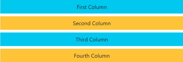
همچنین میتوانید با استفاده از کلاسهای نمایشی واکنش گرا (responsive display utilities)، مشخص کنید که شکست ستون فقط در اندازههای خاصی از صفحه (مثل موبایل یا تبلت) اتفاق بیفتد.

|
1 2 3 4 5 6 7 8 9 10 11 12 13 14 15 16 17 18 19 20 21 22 23 24 |
<!DOCTYPE html> <html lang="en"> <head> <title>Bootstrap - Columns</title> <meta charset="UTF-8"> <meta http-equiv="X-UA-Compatible" content="IE=edge"> <meta name="viewport" content="width=device-width, initial-scale=1.0"> <link href="https://cdn.jsdelivr.net/npm/bootstrap@5.3.0-alpha3/dist/css/bootstrap.min.css" rel="stylesheet"> <script src="https://cdn.jsdelivr.net/npm/bootstrap@5.3.0-alpha3/dist/js/bootstrap.bundle.min.js"></script> </head> <body> <div class="container text-center mt-2"> <div class="row"> <div class="col-6 col-sm-4 bg-info">First Column</div> <div class="col-6 col-sm-4 bg-warning">Second Column</div> <div class="w-100 d-none d-md-block"></div> <div class="col-6 col-sm-4 bg-primary">Third Column</div> <div class="col-6 col-sm-4 bg-light">Fourth Column</div> </div> </div> </body> </html> |
تغییر ترتیب نمایش ستونها در بوت استرپ
بوت استرپ این امکان را در اختیار شما قرار میدهد که ترتیب نمایش ستون ها را بر اساس اندازه صفحه تغییر دهید. این ویژگی به کمک کلاس های ترتیبدهی (.order-) انجام میشود و برای ساخت چیدمانهای واکنش گرا بسیار کاربردی است.
کلاسهای ترتیبدهی (Order Classes)
برای کنترل ترتیب نمایش ستون ها، میتوانید از کلاسهای .order- استفاده کنید. این کلاسها واکنش گرا هستند، بنابراین میتوانید در هر نقطه شکست (مانند .order-2 یا order-md-3) ترتیب نمایش ستون ها را بهطور مستقل تنظیم کنید.
بهطور پیشفرض، این کلاسها مقادیری از 1 تا 5 را در تمام سطوح گرید پشتیبانی میکنند. در صورت نیاز، میتوانید تعداد کلاسهای در دسترس را از طریق متغیرهای Sass به دلخواه افزایش یا کاهش دهید.
|
1 2 3 4 5 6 7 8 9 10 11 12 13 14 15 16 17 18 19 20 21 22 23 24 25 26 |
<!DOCTYPE html> <html lang="en"> <head> <title>Bootstrap - Columns</title> <meta charset="UTF-8"> <meta http-equiv="X-UA-Compatible" content="IE=edge"> <meta name="viewport" content="width=device-width, initial-scale=1.0"> <link href="https://cdn.jsdelivr.net/npm/bootstrap@5.3.0-alpha3/dist/css/bootstrap.min.css" rel="stylesheet"> <script src="https://cdn.jsdelivr.net/npm/bootstrap@5.3.0-alpha3/dist/js/bootstrap.bundle.min.js"></script> </head> <body> <div class="container text-center"> <div class="row"> <div class="col bg-info"> no order applied. </div> <div class="col order-5 bg-warning"> with an order of 5. </div> <div class="col order-1 bg-primary"> with an order of 1. </div> </div> </div> </body> </html> |
علاوه بر این، میتوانید از کلاس های واکنش گرای .order-first و .order-last برای تغییر ترتیب نمایش عناصر استفاده کنید.
این کلاسها به ترتیب از ویژگیهای order: -1 و order: 6 استفاده میکنند تا عنصر مورد نظر را در ابتدا یا انتهای ترتیب قرار دهند.
در صورت نیاز، میتوانید این کلاسها را همراه با کلاسهای شمارهدار .order-* نیز ترکیب کنید.

|
1 2 3 4 5 6 7 8 9 10 11 12 13 14 15 16 17 18 19 20 21 22 23 24 25 26 |
<!DOCTYPE html> <html lang="en"> <head> <title>Bootstrap - Columns</title> <meta charset="UTF-8"> <meta http-equiv="X-UA-Compatible" content="IE=edge"> <meta name="viewport" content="width=device-width, initial-scale=1.0"> <link href="https://cdn.jsdelivr.net/npm/bootstrap@5.3.0-alpha3/dist/css/bootstrap.min.css" rel="stylesheet"> <script src="https://cdn.jsdelivr.net/npm/bootstrap@5.3.0-alpha3/dist/js/bootstrap.bundle.min.js"></script> </head> <body> <div class="container text-center mt-2"> <div class="row"> <div class="col order-last bg-info"> First column as ordered last </div> <div class="col order-first bg-primary"> Second column as ordered first </div> <div class="col bg-warning"> Third column (unordered) </div> </div> </div> </body> </html> |
افزودن فاصله به ستونها (Offsetting Columns)
در سیستم گرید بوت استرپ، میتوانید ستونها را به دو روش از موقعیت اولیهشان جابجا کنید:
-
استفاده از کلاسهای
.offset-* -
استفاده از کلاسهای مربوط به margin (فاصله بیرونی)
کلاسهای offset دقیقاً بر اساس اندازه ستونها طراحی شدهاند، در حالیکه کلاسهای margin برای ایجاد فاصلههای سریع و انعطافپذیر مناسبتر هستند.
کلاسهای Offset
برای جابجایی یک ستون به سمت راست، از کلاسهای .offset-md-* استفاده کنید.
این کلاسها با افزودن ستونهایی به حاشیه چپ یک ستون، آن را از موقعیت اولیهاش به سمت راست هل میدهند.
برای مثال، کلاس .offset-md-4 باعث میشود یک ستون با کلاس .col-md-4 چهار ستون از سمت چپ فاصله بگیرد و در موقعیتی جدید نمایش داده شود.
|
1 2 3 4 5 6 7 8 9 10 11 12 13 14 15 16 17 18 19 20 21 22 23 24 25 26 27 |
<!DOCTYPE html> <html lang="en"> <head> <title>Bootstrap - Columns</title> <meta charset="UTF-8"> <meta http-equiv="X-UA-Compatible" content="IE=edge"> <meta name="viewport" content="width=device-width, initial-scale=1.0"> <link href="https://cdn.jsdelivr.net/npm/bootstrap@5.3.0-alpha3/dist/css/bootstrap.min.css" rel="stylesheet"> <script src="https://cdn.jsdelivr.net/npm/bootstrap@5.3.0-alpha3/dist/js/bootstrap.bundle.min.js"></script> </head> <body> <div class="container text-center"> <div class="row mt-2"> <div class="col-md-2 bg-info p-2">First Column</div> </div> <div class="row mt-2"> <div class="col-md-2 offset-md-3 bg-warning p-2">Second Column</div> </div> <div class="row mt-2"> <div class="col-md-2 offset-md-2 bg-info p-2">Third Column</div> </div> <div class="row mt-2"> <div class="col-md-2 offset-md-4 bg-warning p-2">Fourth Column</div> </div> </div> </body> </html> |
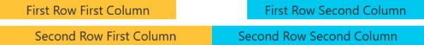
بازنشانی فاصله ستون ها در نقاط شکست واکنش گرا
برای حذف فاصلههای ایجادشده با offset در اندازههای مختلف صفحه، لازم است در نقاط شکست (breakpoints) مورد نظر، کلاسهای offset را بازنشانی کنید.
|
1 2 3 4 5 6 7 8 9 10 11 12 13 14 15 16 17 18 19 20 21 22 23 |
<!DOCTYPE html> <html lang="en"> <head> <title>Bootstrap - Columns</title> <meta charset="UTF-8"> <meta http-equiv="X-UA-Compatible" content="IE=edge"> <meta name="viewport" content="width=device-width, initial-scale=1.0"> <link href="https://cdn.jsdelivr.net/npm/bootstrap@5.3.0-alpha3/dist/css/bootstrap.min.css" rel="stylesheet"> <script src="https://cdn.jsdelivr.net/npm/bootstrap@5.3.0-alpha3/dist/js/bootstrap.bundle.min.js"></script> </head> <body> <div class="container text-center"> <div class="row mt-2"> <div class="col-sm-5 col-md-6 bg-warning">First Row First Column</div> <div class="col-sm-5 offset-sm-2 col-md-6 offset-md-0 bg-info">First Row Second Column</div> </div> <div class="row mt-2"> <div class="col-sm-6 col-md-5 col-lg-6 bg-warning">Second Row First Column</div> <div class="col-sm-6 col-md-5 offset-md-2 col-lg-6 offset-lg-0 bg-info">Second Row Second Column</div> </div> </div> </body> </html> |
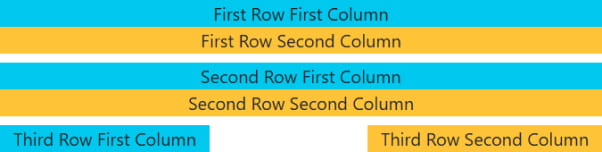
ابزارهای margin (فاصله بیرونی)
در نسخه ۴ بوت استرپ، با استفاده از فلکس باکس میتوانید از کلاسهای کمکی margin مانند .me-auto برای ایجاد فاصله بین ستونهای همسطح (sibling columns) استفاده کنید.
این کلاس باعث میشود ستون مورد نظر به سمت چپ هل داده شود و از ستون کناریاش جدا گردد، بدون نیاز به تعریف offset مجزا.
|
1 2 3 4 5 6 7 8 9 10 11 12 13 14 15 16 17 18 19 20 21 22 23 24 25 26 27 |
<!DOCTYPE html> <html lang="en"> <head> <title>Bootstrap - Columns</title> <meta charset="UTF-8"> <meta http-equiv="X-UA-Compatible" content="IE=edge"> <meta name="viewport" content="width=device-width, initial-scale=1.0"> <link href="https://cdn.jsdelivr.net/npm/bootstrap@5.3.0-alpha3/dist/css/bootstrap.min.css" rel="stylesheet"> <script src="https://cdn.jsdelivr.net/npm/bootstrap@5.3.0-alpha3/dist/js/bootstrap.bundle.min.js"></script> </head> <body> <div class="container text-center"> <div class="row mt-2"> <div class="col-md-4 bg-info"> First Row First Column</div> <div class="col-md-4 ms-auto bg-warning">First Row Second Column</div> </div> <div class="row mt-2"> <div class="col-md-3 ms-md-auto bg-info">Second Row First Column</div> <div class="col-md-3 ms-md-auto bg-warning">Second Row Second Column</div> </div> <div class="row mt-2"> <div class="col-auto me-auto bg-info">Third Row First Column</div> <div class="col-auto bg-warning">Third Row Second Column</div> </div> </div> </body> </html> |
کلاس های مستقل ستون (Standalone Column Classes)
برای اختصاص دادن یک عرض مشخص به یک عنصر، میتوانید از کلاسهای .col-* حتی خارج از ساختار .row استفاده کنید.
توجه داشته باشید که وقتی کلاسهای ستونی خارج از ردیف یا بهصورت غیرمستقیم درون .row قرار بگیرند، فاصلههای داخلی (padding) به آنها اعمال نمیشود.
|
1 2 3 4 5 6 7 8 9 10 11 12 13 14 15 16 17 18 19 |
<!DOCTYPE html> <html lang="en"> <head> <title>Bootstrap - Columns</title> <meta charset="UTF-8"> <meta http-equiv="X-UA-Compatible" content="IE=edge"> <meta name="viewport" content="width=device-width, initial-scale=1.0"> <link href="https://cdn.jsdelivr.net/npm/bootstrap@5.3.0-alpha3/dist/css/bootstrap.min.css" rel="stylesheet"> <script src="https://cdn.jsdelivr.net/npm/bootstrap@5.3.0-alpha3/dist/js/bootstrap.bundle.min.js"></script> </head> <body> <div class="col-3 p-2 mb-2 bg-info"> First Column </div> <div class="col-sm-6 p-2 bg-warning"> Second Column </div> </body> </html> |
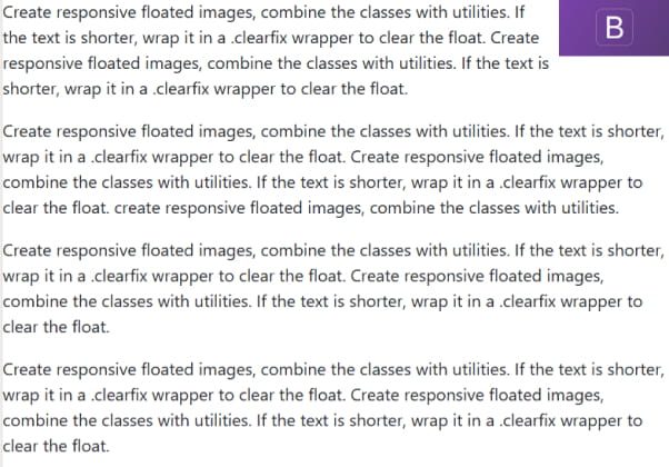
برای ساخت تصاویر شناور (float) واکنش گرا، کلاس های مربوط به float را با کلاس های کمکی بوت استرپ ترکیب کنید.
اگر متن کنار تصویر کوتاهتر از آن است، برای جلوگیری از بههم ریختگی چیدمان، متن را داخل یک عنصر با کلاس .clearfix قرار دهید تا خاصیت float تصویر خنثی شود.
|
1 2 3 4 5 6 7 8 9 10 11 12 13 14 15 16 17 18 19 20 |
<!DOCTYPE html> <html lang="en"> <head> <title>Bootstrap - Columns</title> <meta charset="UTF-8"> <meta http-equiv="X-UA-Compatible" content="IE=edge"> <meta name="viewport" content="width=device-width, initial-scale=1.0"> <link href="https://cdn.jsdelivr.net/npm/bootstrap@5.3.0-alpha3/dist/css/bootstrap.min.css" rel="stylesheet"> <script src="https://cdn.jsdelivr.net/npm/bootstrap@5.3.0-alpha3/dist/js/bootstrap.bundle.min.js"></script> </head> <body> <div class="clearfix"> <img src="\bootstrap\images\tut.png" class="col-sm-2 float-sm-end mb-2 ms-sm-2" alt="..."> <p> Create responsive floated images, combine the classes with utilities. If the text is shorter, wrap it in a .clearfix wrapper to clear the float. Create responsive floated images, combine the classes with utilities. If the text is shorter, wrap it in a .clearfix wrapper to clear the float.</p> <p> Create responsive floated images, combine the classes with utilities. If the text is shorter, wrap it in a .clearfix wrapper to clear the float. Create responsive floated images, combine the classes with utilities. If the text is shorter, wrap it in a .clearfix wrapper to clear the float. create responsive floated images, combine the classes with utilities.</p> <p> Create responsive floated images, combine the classes with utilities. If the text is shorter, wrap it in a .clearfix wrapper to clear the float. Create responsive floated images, combine the classes with utilities. If the text is shorter, wrap it in a .clearfix wrapper to clear the float.</p> <p> Create responsive floated images, combine the classes with utilities. If the text is shorter, wrap it in a .clearfix wrapper to clear the float. Create responsive floated images, combine the classes with utilities. If the text is shorter, wrap it in a .clearfix wrapper to clear the float.</p> </div> </body> </html> |
راستی! برای دریافت مطالب جدید در کانال تلگرام یا پیج اینستاگرام سورس باران عضو شوید.
- انتشار: ۲۶ اردیبهشت ۱۴۰۴
دسته بندی موضوعات
- آموزش ارز دیجیتال
- آموزش برنامه نویسی
- آموزش متنی برنامه نویسی
- اطلاعیه و سایر مطالب
- پروژه برنامه نویسی
- دوره های تخصصی برنامه نویسی
- رپورتاژ
- فیلم های آموزشی
- ++C
- ADO.NET
- Adobe Flash
- Ajax
- AngularJS
- apache
- ARM
- Asp.Net
- ASP.NET MVC
- AVR
- Bootstrap
- CCNA
- CCNP
- CMD
- CSS
- Dreameaver
- EntityFramework
- HTML
- IOS
- jquery
- Linq
- Mysql
- Oracle
- PHP
- PHPMyAdmin
- Rational Rose
- silver light
- SQL Server
- Stimulsoft Reports
- Telerik
- UML
- VB.NET&VB6
- WPF
- Xml
- آموزش های پروژه محور
- اتوکد
- الگوریتم تقریبی
- امنیت
- اندروید
- اندروید استودیو
- بک ترک
- بیسیک فور اندروید
- پایتون
- جاوا
- جاوا اسکریپت
- جوملا
- دلفی
- دوره آموزش Go
- دوره های رایگان پیشنهادی
- زامارین
- سئو
- ساخت CMS
- سی شارپ
- شبکه و مجازی سازی
- طراحی الگوریتم
- طراحی بازی
- طراحی وب
- فتوشاپ
- فریم ورک codeigniter
- فلاتر
- کانستراکت
- کریستال ریپورت
- لاراول
- معماری کامپیوتر
- مهندسی اینترنت
- هوش مصنوعی
- یونیتی
- کتاب های آموزشی
- Android
- ASP.NET
- AVR
- LINQ
- php
- Workflow
- اچ تی ام ال
- بانک اطلاعاتی
- برنامه نویسی سوکت
- برنامه نویسی موبایل
- پاسکال
- پایان نامه
- پایتون
- جاوا
- جاوا اسکریپت
- جی کوئری
- داده کاوی
- دلفی
- رباتیک
- سئو
- سایر کتاب ها
- سخت افزار
- سی اس اس
- سی پلاس پلاس
- سی شارپ
- طراحی الگوریتم
- فتوشاپ
- مقاله
- مهندسی نرم افزار
- هک و امنیت
- هوش مصنوعی
- ویژوال بیسیک
- نرم افزار و ابزار برنامه نویسی
- وردپرس